
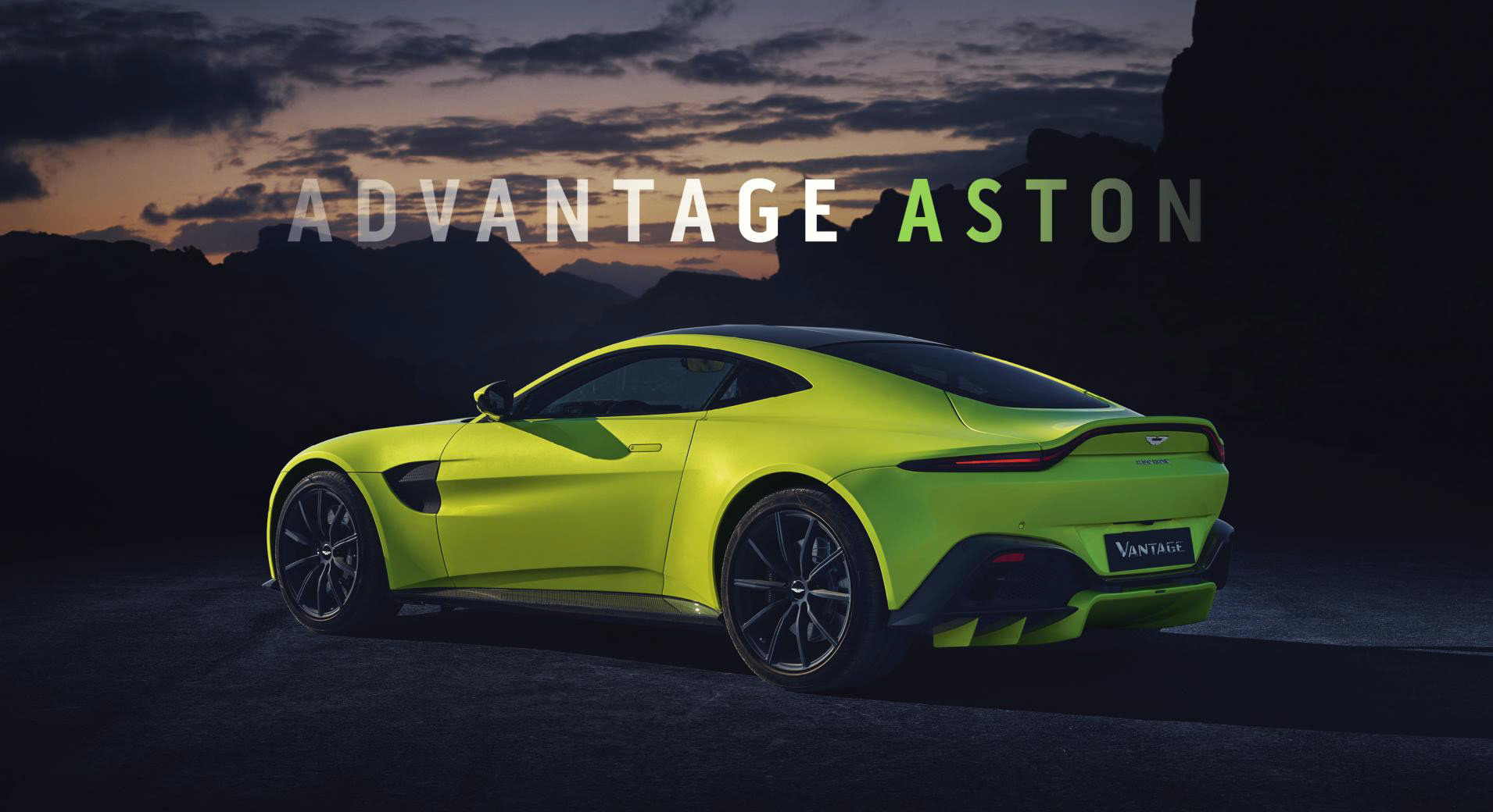
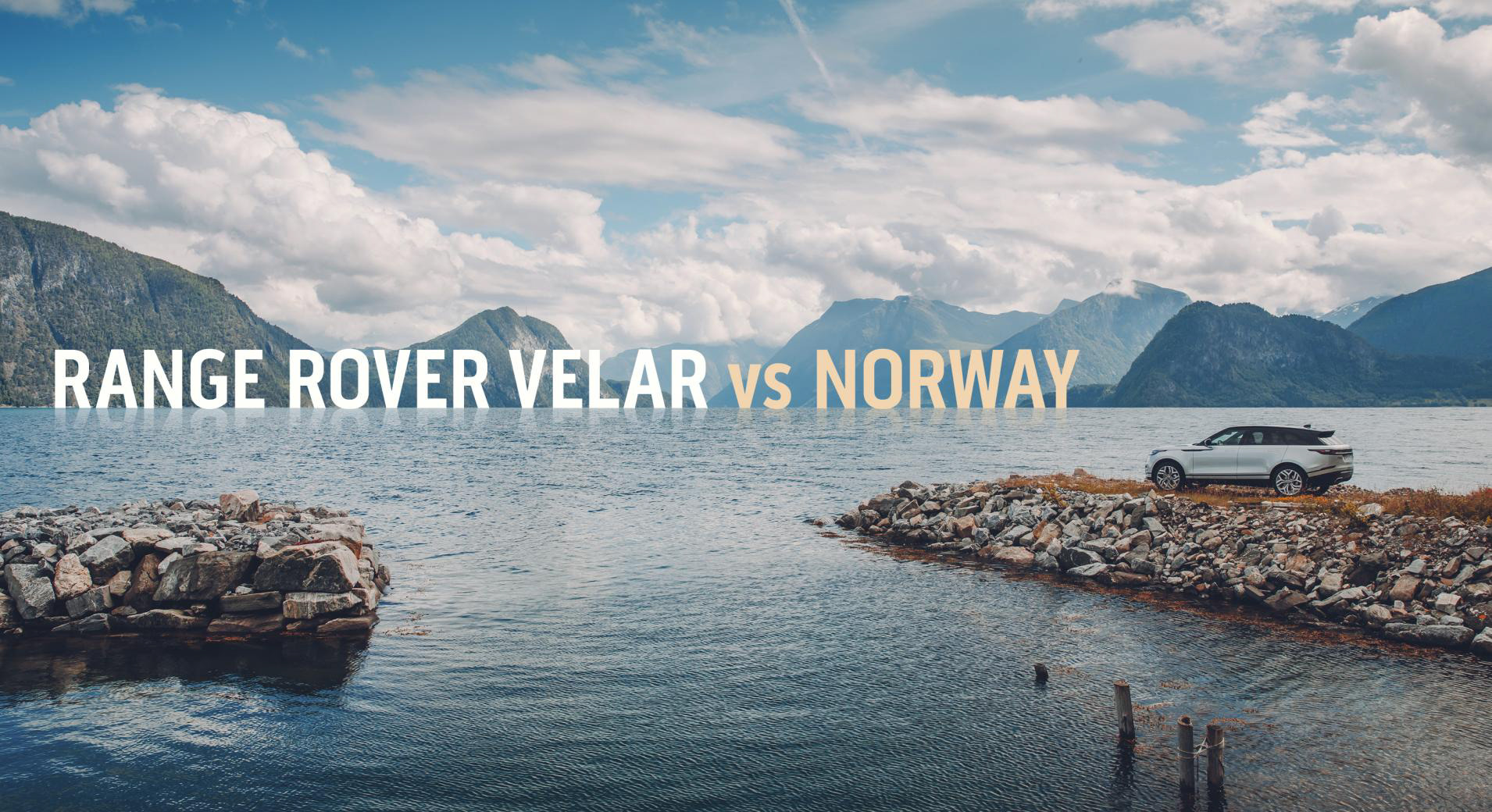
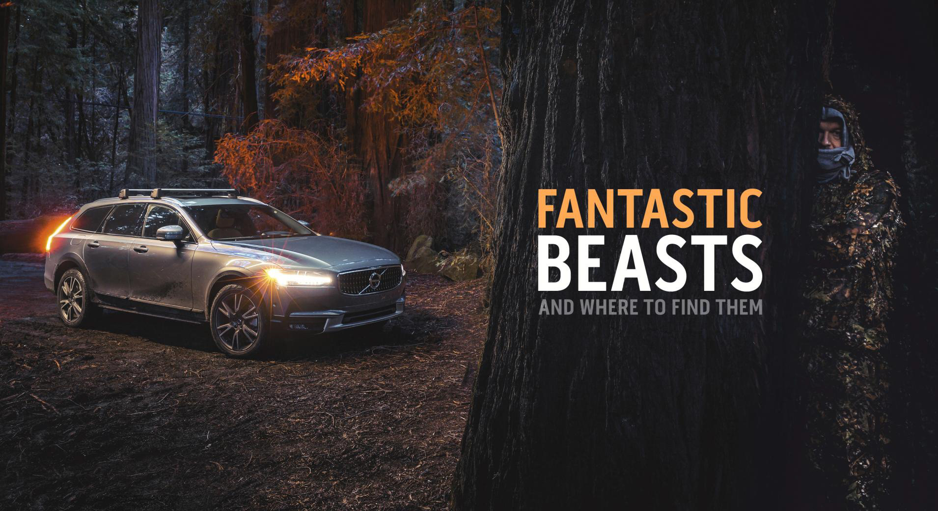
With the editorial style of my project, it is imperative that I consider how my images work with text. With many articles, real emphasis is put on the title page, to secure the reader's attention. Often, you will see images, such as these, covering a double spread. This gives huge emphasis on the image and text, allowing you to get up close and see a great deal of detail - setting the scene for the rest of the article.

(Top Gear Magazine, 2017)
As is evident in the images, there is a consistent theme throughout. The text rarely has a complicated font style as it needs to be easy to read, but takes visual cues from the image it is placed in. For instance, a common or important colour is usually incorporated into the text to help merge the two entities more seamlessly.
Composition is another key image feature taken advantage of. Dead space is used as a relatively clean area to place text over, to give it the best chance of standing out. In motoring editorial this often materialises as either the sky or the road beneath the subject(s). In some cases framing is taken advantage of by using an area with strong contrast or a back/foreground subject that is sharing the space with the main subject.


(Top Gear Magazine, 2017)
(Top Gear Magazine, 2017)
References
Top Gear Magazine (2017). Fantastic Beasts and Where to Find Them. [image] Available at: https://www.topgear.com/car-news/big-reads/hunting-bigfoot-volvo-v90-cross-country [Accessed 18 Jan. 2018].
Top Gear Magazine (2017). Guntherwerks. [image] Available at: https://www.topgear.com/car-news/big-reads/remastered-911-gunther-werks-mad-400r-driven [Accessed 18 Jan. 2018].