For this workshop, I have focused on improving my product photography skills, as this is an area of photography that I don't pay much attention to.
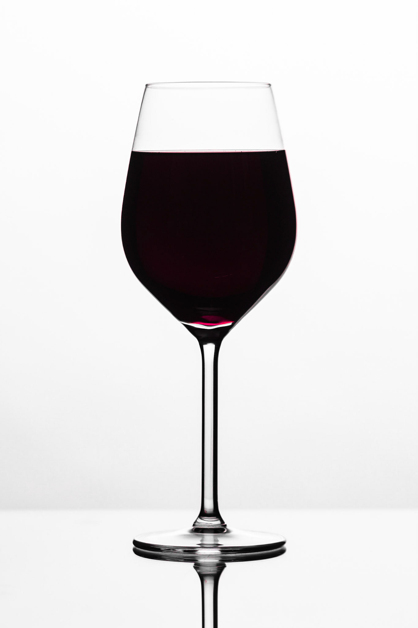
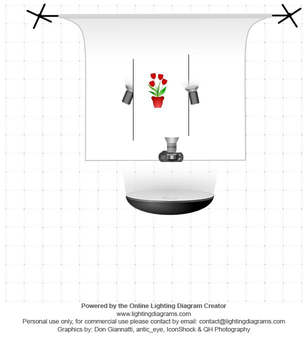
To create this image I have used edge lighting to define and separate the edge of the wine glass from the background. This included two hard lights directed at the white backdrop - creating a strong highlight. There is also a soft box directly in front to balance the exposure of the wine glass.
During the setup of the shot, a piece of glass was used to place the wine glass on. This created a clear reflection that eliminates the notion that the product is floating in mid-air.
When editing the image, I have tried to draw the viewer's eye to the centre of the picture - as this is where the product is positioned. To do this I have edited the tone curve to modify the intensity of the dark and light areas of the image. Additionally, I have used the contrast tool to further this effect. Doing this has separated the glass from the background. The purity of the white of the background shows this particularly well.
I experimented with different colours of liquid in the glass, but I thought this dark red was most realistic and attractive. The only problem is that it so dark that the light didn't pass through it very well, meaning the colours don't have much vibrance or pop to them. This would have made it stand out further.
As it was only squash in the wine glass. I have adjusted the vibrance and hue of the red channel of colour to make it look more like wine and to also enhance its attractiveness. I found that too much vibrance makes it seem very unnatural, even though it makes the image more eye catching.
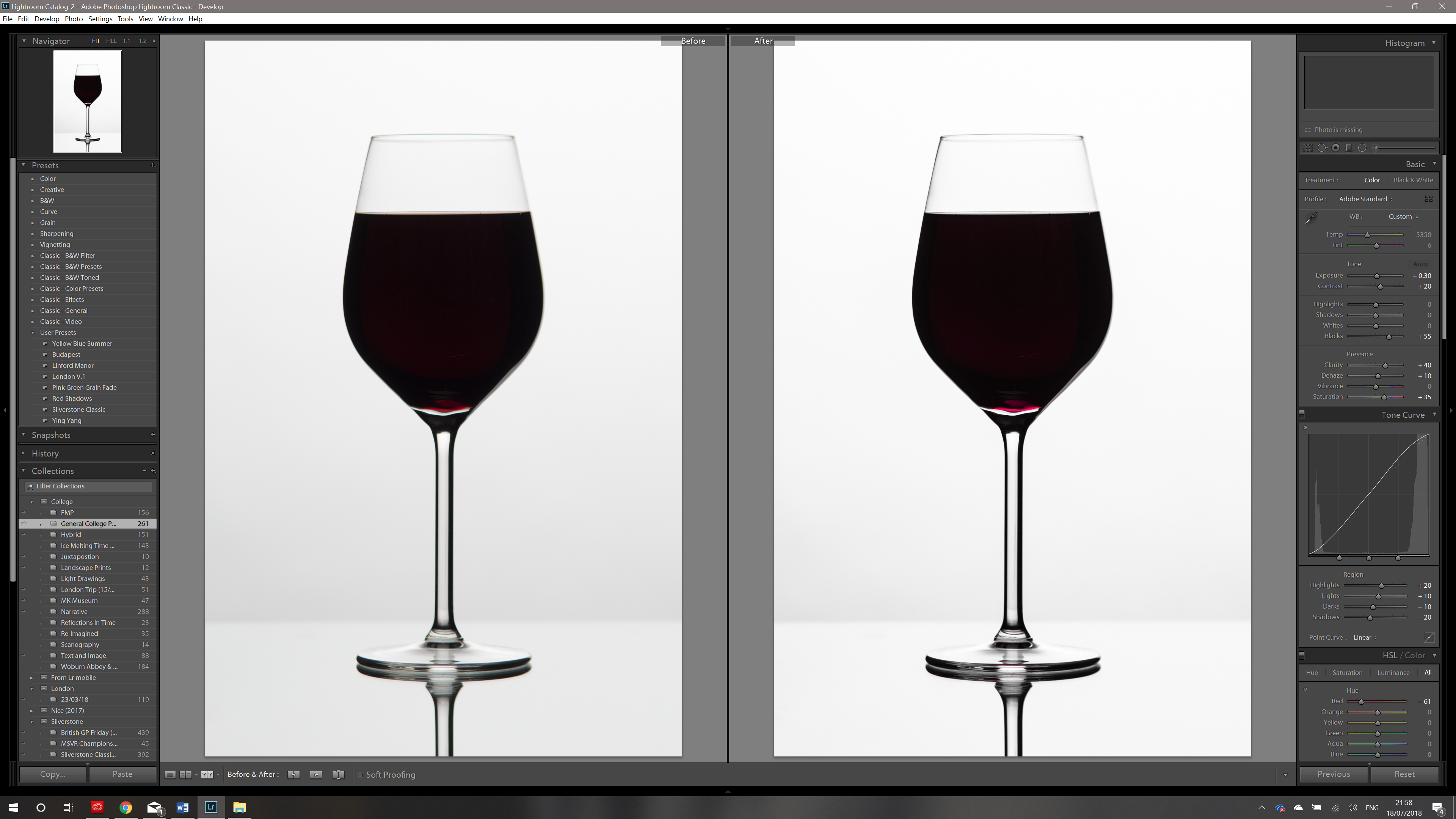
The only thing that bugs me about this set of images is that they didn't come out as sharp as originally hoped. The brim of the wine glass is particularly soft. Next time I will use manual focus to precisely focus the image, ensuring it is sharp all over. In this case the autofocus system on my camera has latched onto the stem of the glass which sticks out further than the brim. This also suggests that I had set an aperture that is too wide.
I love the contrast in colours and tones in this image! Additionally I feel I have framed it well, making use of just the right amount of dead space within the image confines.
In Conclusion
I really don't think this type of photography suits the FMP brief. As it is about MK, I believe that purely location based photos should be used to fulfil it. This Style could potentially be implemented if a series of images were created which highlighted very specific products or souvenirs etc. relating to Milton Keynes. However, I would still be reluctant as the image outcomes would look very professional, monotonous and clean. This is not always a bad thing, but in an office space, specifically like Fortna's break room, you would feel more pleased to look at something more busy, creative and vibrant.
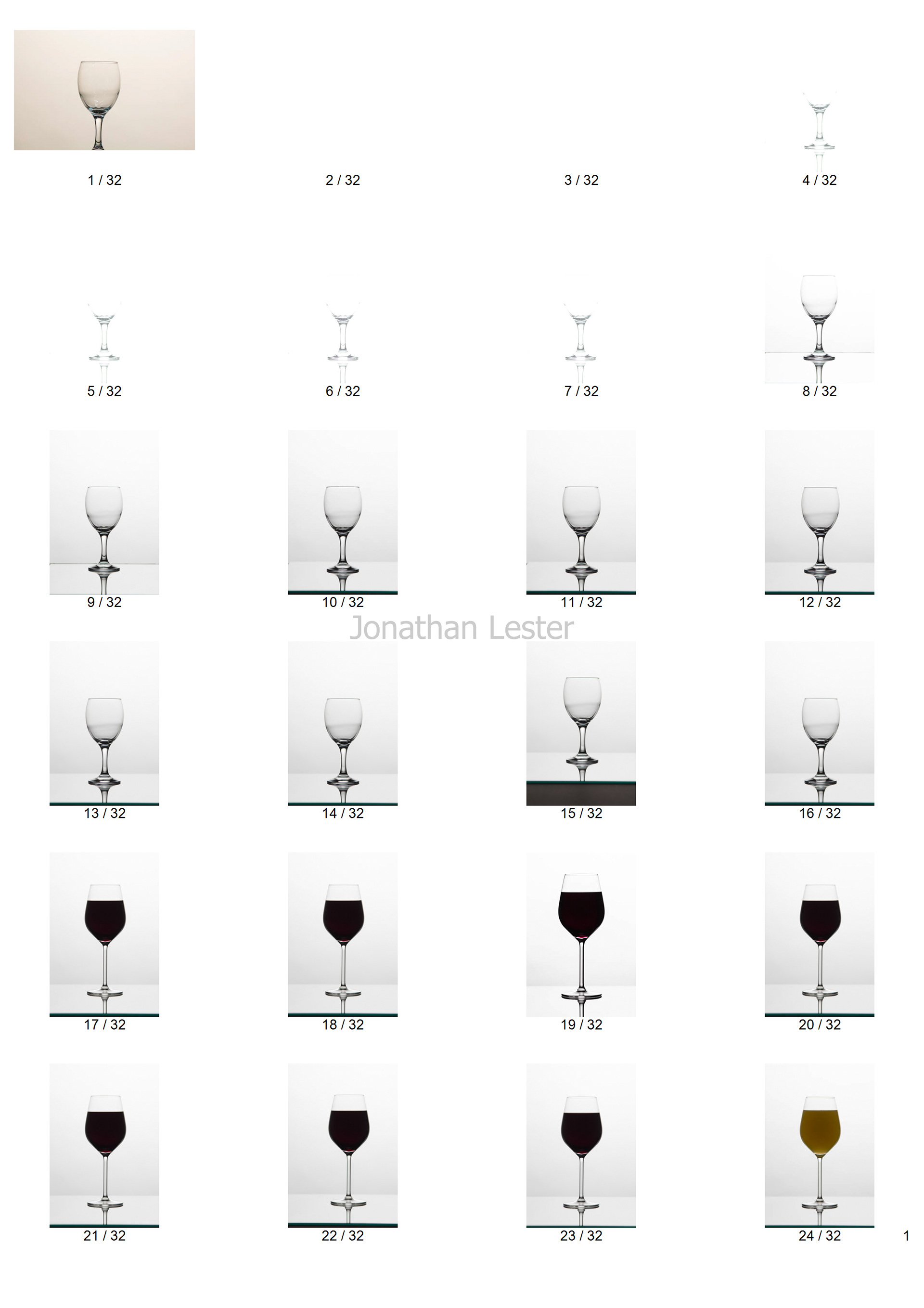
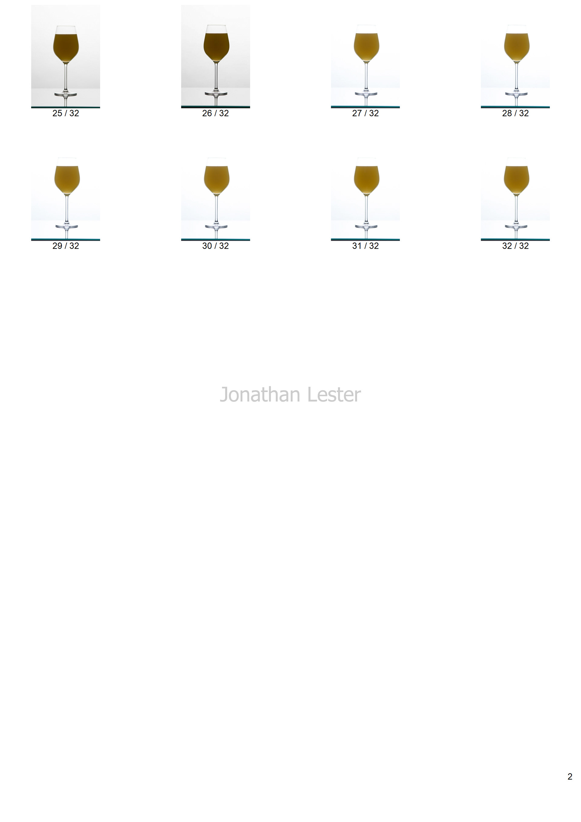
Contact Sheets