
Reflection
Before the start of this exhibition I was very anxious about displaying my own work in front of so many people, but it was nice to be amongst people that also felt this way, to some extent or another.
The general buzz of the evening was very positive as everyone was excited to show their work and see everyone elses. After the effort put into setting up the exhibition I think that everyone was more relieved than anything else to relax into the evening and absorb the atmosphere and positive vibes being given off by all the guests. Family and friends were even more excited than me to see my work on display! It was nice to feel that support from everyone.
I was very pleased with the location of my work in the exhibition as I had a whole wall to myself and my piece was well lit by a spot light. I feel that this drew direct focus on my image, leaving viewers undistracted from other pieces of work that may have been on the wall on either side. The only down side to my location would have been the fact that it was around the corner from the entrance, so is not immediately visible.
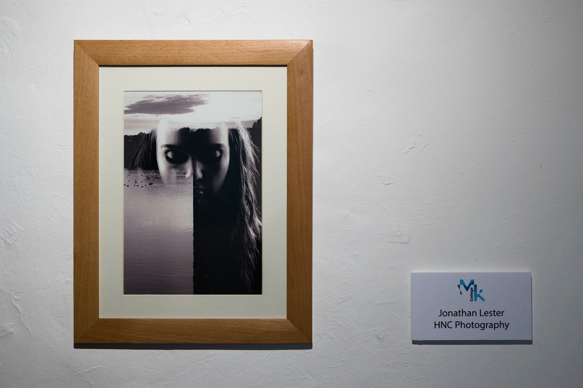
My final piece on display at Westbury Arts Centre.
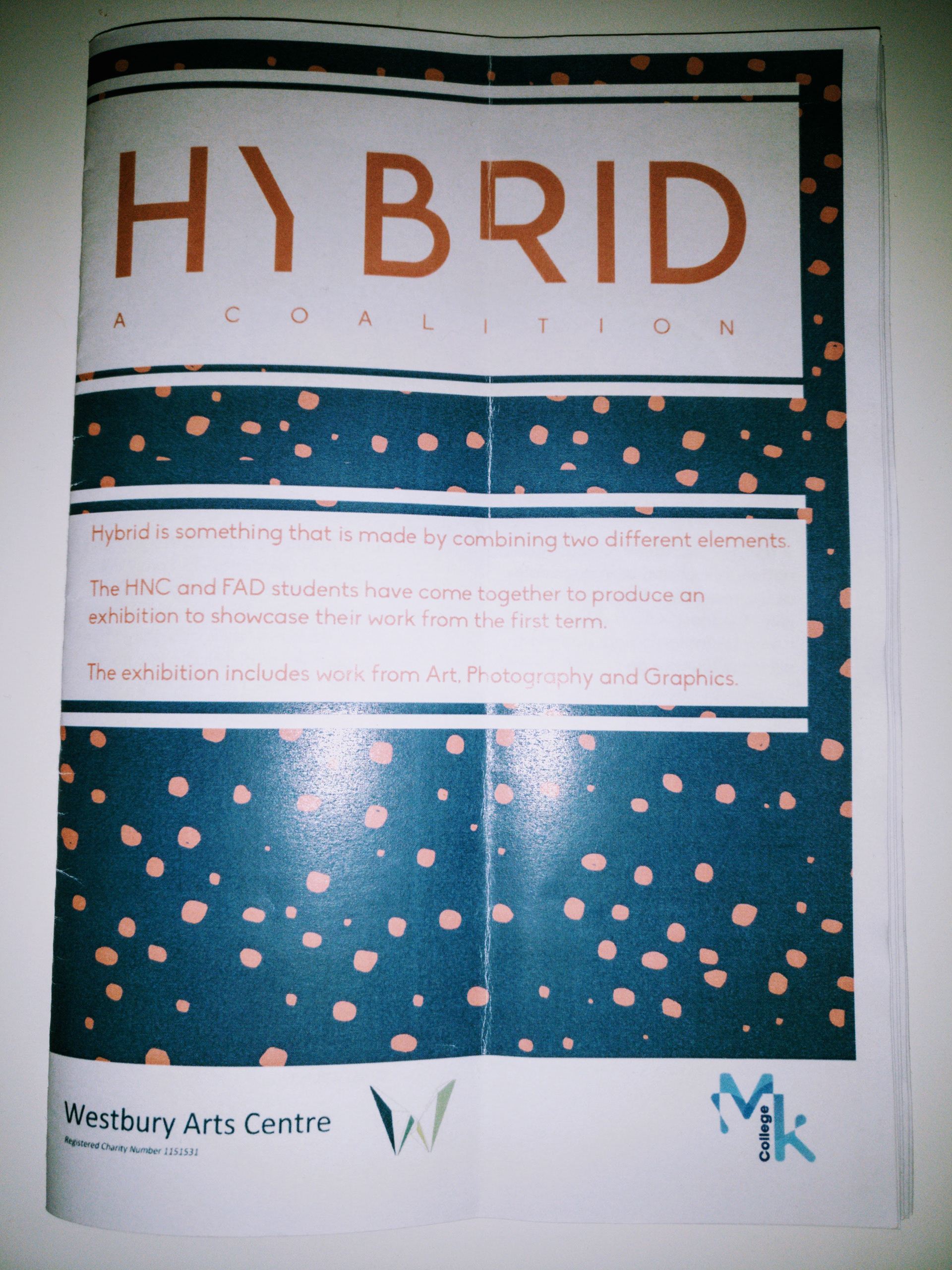
HYBRID: A COALITION
Exhibition guide book.
Peer Feedback and Critique
- One comment mentions how it looks like the water is pouring out of the eyes, almost like tears. This adds to the sombre mood of the image as a whole.
- One of the two guests we had join us for our group critique session was a photographer. This was particularly helpful and lucky as there were only a handful of photographers exhibiting work at the exhibition in comparison to the number of art and graphic students. He mentioned that he felt the top half of the image looked uneven because of the dark cloud on the left and the very bright patch in the top right. I feel that the cloud balances out the darkness of it opposite side, however I do agree that this part is blown out. He went on to mention that this can easily be avoided by taking more time on location to ensure that you have an image that is exposed properly.
- Also suggested was the use of a black frame. This would tie the piece together by better matching the black and white image.
- Leading on from that discussion, it was brought up that maybe the image would have benefitted from the removal of the frame and a vast enlargement. I agree that the image would probably look more captivating if it were to scaled up. If this were the case though, I would be spending more money on the printing of said image. I don't agree with the removal of the frame, however, as I feel this brings a professional feel to the piece.
I am more than happy to receive these critiques as I am aware of many of the imperfections in my piece. Some of these points I had already identified having stared at my work for a considerable amount of time after having it printed. Moving forward to the next project I have to be conscious of these notes so that I can produce an even better final piece. Of particular focus will be the way that I present my work in the future, as I feel this is where I let myself down the most.
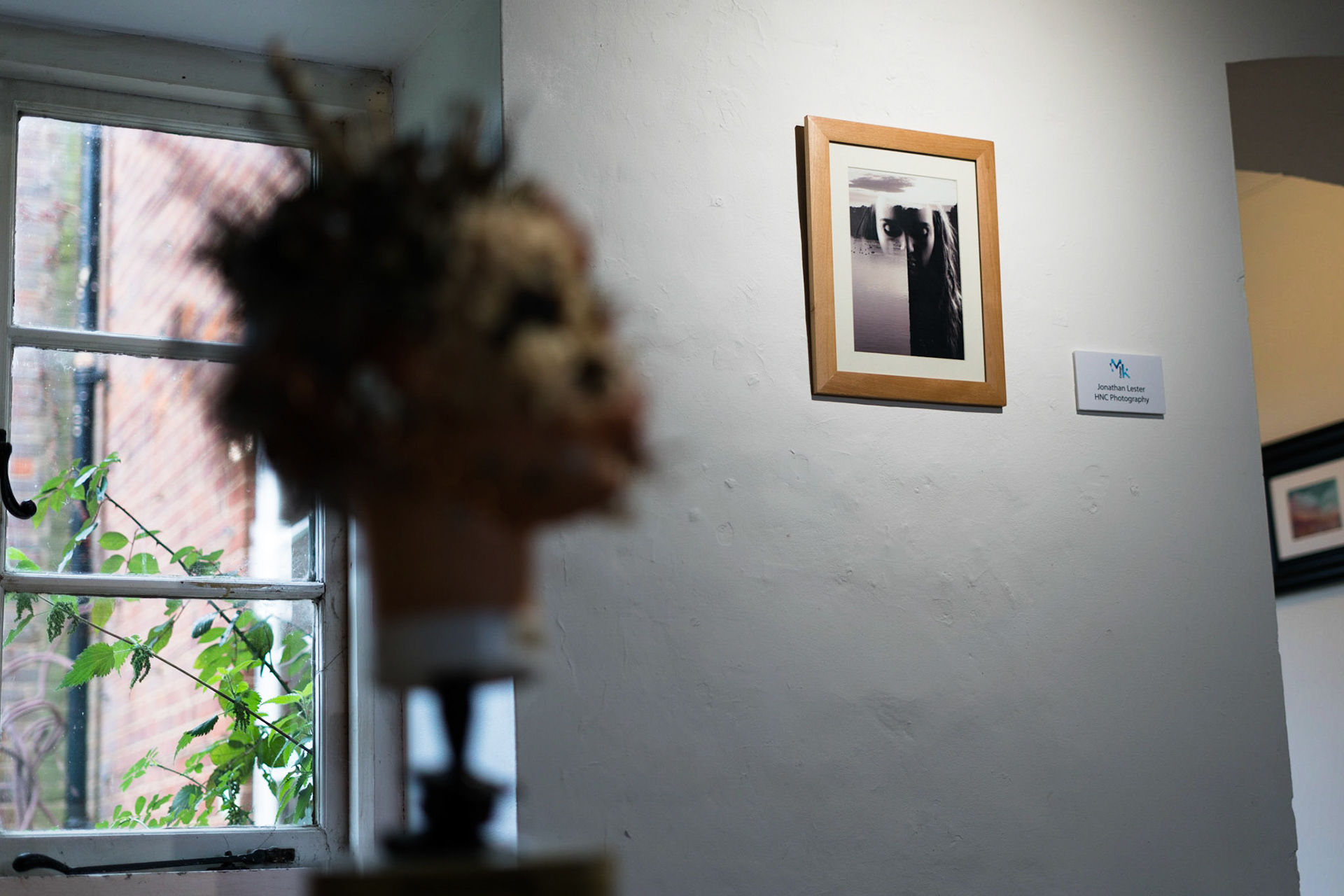
Mounted on its own wall, around the corner from the entrance.
Final Piece Evaluation
As a whole I am happy with the outcome of my final image, however I am also aware of the aspects that could be improved upon. First of all, during the time I spent collecting landscape images that could be used as one half of the double exposure, I could have spent much more time focusing on getting a 'perfect' shot. At the time I was more concerned with finding a backdrop that would work well with the concept I had in the back of my mind, instead of spending considered time and effort on producing a technically well produced and balanced image, in camera. For example, in hindsight, I would have waited for the clouds in the sky to be more symmetrical to match the aesthetic of the rest of the image.
Additionally, after spending the week looking at the image as it was displayed at Westbury, I have developed a small dislike to the way that I ended up lighting my model for the portrait portion of the final image. At the moment my model is lit on both sides, with a predominant shadow that runs down the middle of the face. Although this matches the split made by the darkness of the concrete and the brightness of the water, I feel it leaves the image as a whole slightly unbalanced. If I were to repeat the photoshoot again I would probably only have the right hand side of the face lit, to counteract the darkness of the right hand side of the landscape image. Again, I feel this would complement the balance of the image as a whole, especially as it is in black and white.
A continuation of the last point leads me to feel that I should have made a tighter crop on the models face to allow me to position the face so that the darkness of the trees in the background feel like a mask for the eyes. At the moment it is not quite tight enough to portray this feeling.
The scale of the final image produced would be something I would change in the future. At the moment it is actually quite small and requires you to get up really close to see the detail. A bigger image would be much more impressionable and would allow the audience to take everything in with more ease. However, the way that it was hung in the gallery turned out quite positive due to its height. As it was above most people's eye level, it felt like the viewer was being looked down on by the subject in the image, whereas you are looking up at the subject. As mentioned though, I should have also had the image in a black and white frame to continue the theme as a whole.
I am always highly critical of my own work and never 100% pleased with everything that has gone into and ends up coming out from a piece. In light of this though it is reassuring to hear the many positive comments made by my peers.