
Inspiration is a something that can emerge from anywhere, at any time. In the case it emerged from a small driveway off of Fenny Stratford high street. It is not entirely obvious as to which make of car has been left to decay on a bed of weeds, but to me it looks like some sort of kit car made from fiberglass (or a similar material).
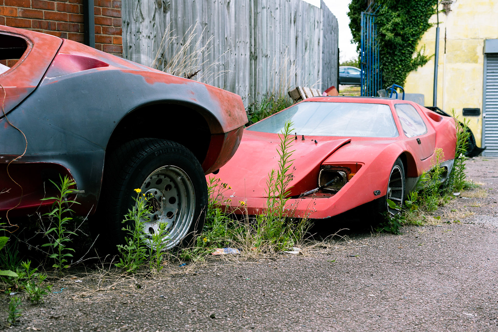
It is not entirely obvious as to which make of car has been left to decay on a bed of weeds, but to me it looks like some sort of kit car made from fiberglass (or a similar material).
This selection of images came about by pure luck. I happened to be walking along this part of the canal with my camera, not looking for anything particular to shoot - especially not in relation to this project. However, the red caught my eye from the high street and I couldn't resist taking a quick set of images.
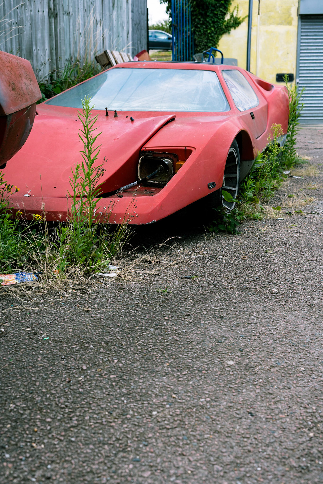
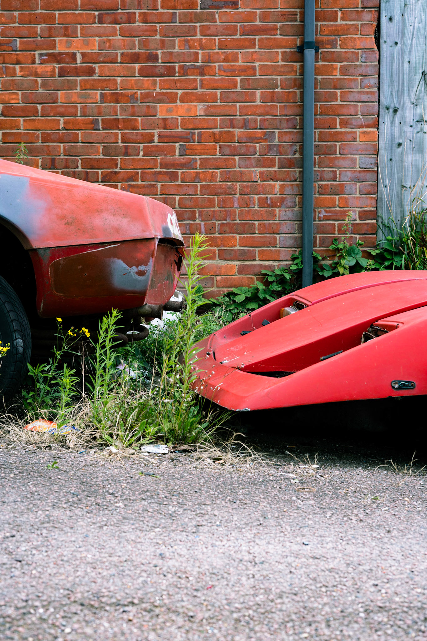
As this wasn't planned, I only caught a few select angles as I didn't want to overstay my welcome on this section of property. I believe the composition and framing of each of these images is good. I tried to get at least one shot that contained some negative space as I was aware that this would be essential in an editorial piece.
Cars have always been something that has been of interest to me and I take great pleasure in photographing them. I love looking for that unique angle that showcases the best angles and lines in a car.
Development
Below are a couple of varied edits that I have used to help develop my initial photograph.
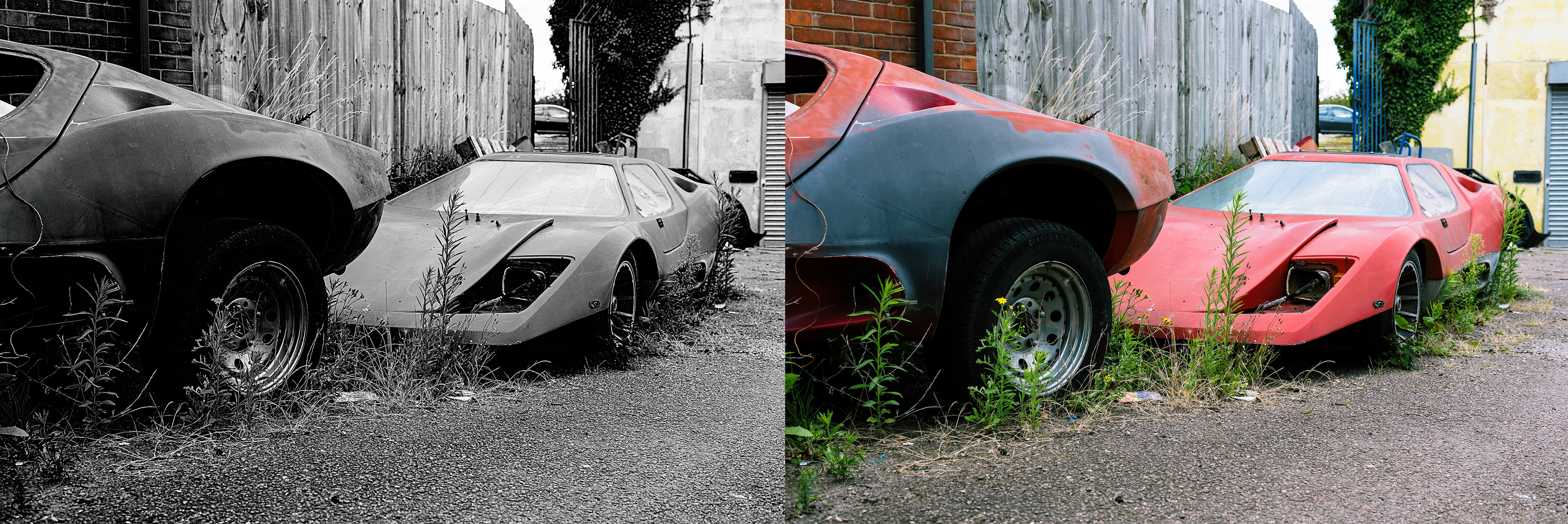
Very simply I have converted the original image to B&W, with emphasis on improving the contrast, especially by pushing the blacks in the image. This adds a lot of structure to the image, in addition to the general effect of clearer shape and form usually brought about by converting to B&W. In the initial images the red of the cars body and the green of the growing weeds is bright and poppy, making it distracting to the eye. Eliminating this keeps the viewers focus on the substance of the images in their entirety.
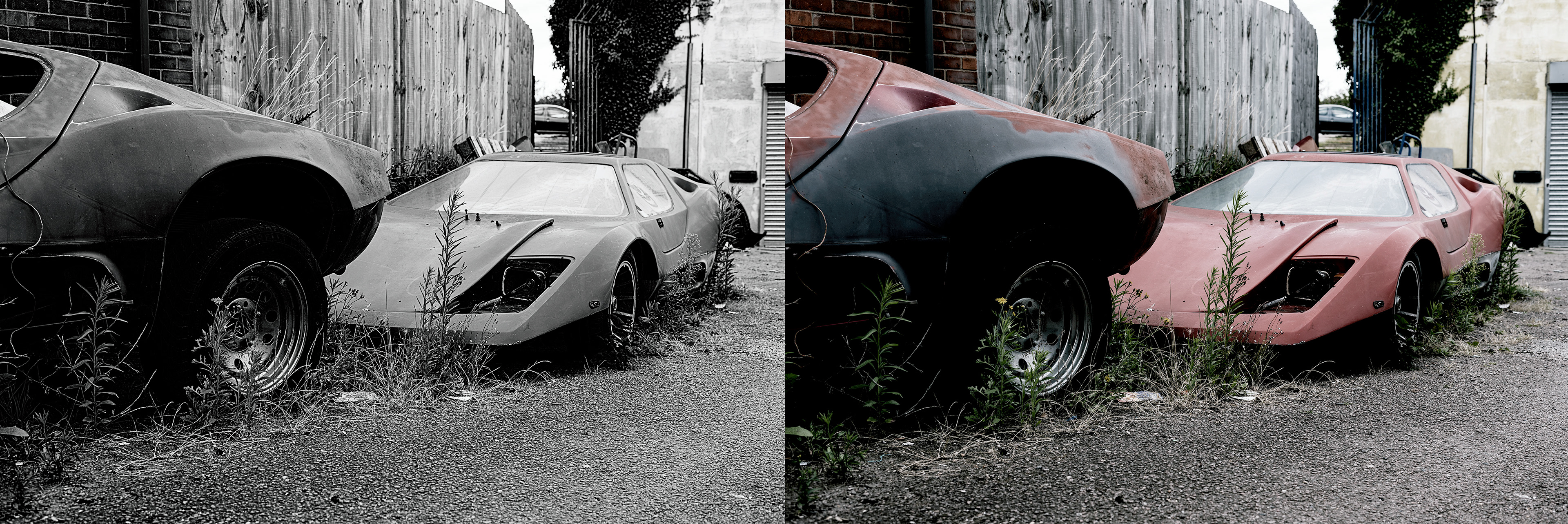
The next experiment involved producing a much less saturated version of the image. Fading out all of the colours leeds to a grungy dark style, which brings more balance to the image by minimising distracting colours. The faded and weathered colours also further the narrative of decay and abandonment with the viewer. Overall, however, I find this style of editing to be very cliche and unappealing - it just looks unprofessional and has been overused.